Time
4 months
Software
Adobe Photoshop, InDesign, Illustrator
Roles
Wireframing, visual designer, web developer (HTML, CSS)
Context
For a school project, I was tasked in researching and rebranding a pre-existing company. I chose the company "Flytographer", which offers photography services all around the world by matching clients to photographers within the same region. I designed and developed a new visual identity including a logotype, colour palette, and a branding book with brand guidelines.
Final Logotype
This is my final logotype compared to Flytographer’s current logotype. Their logotype doesn’t show much storytelling or identity with the simple cursive font. The cursive type also takes extra effort to read. I wanted to make the logotype more adventurous to match their outgoing and fun branding.
Flytographer Logotype
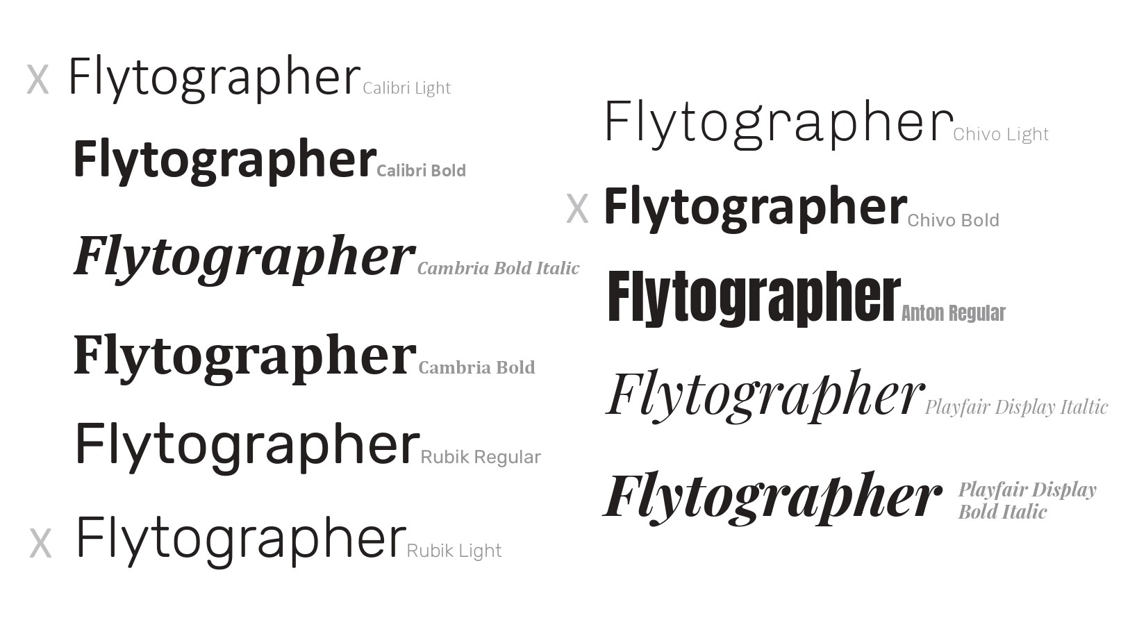
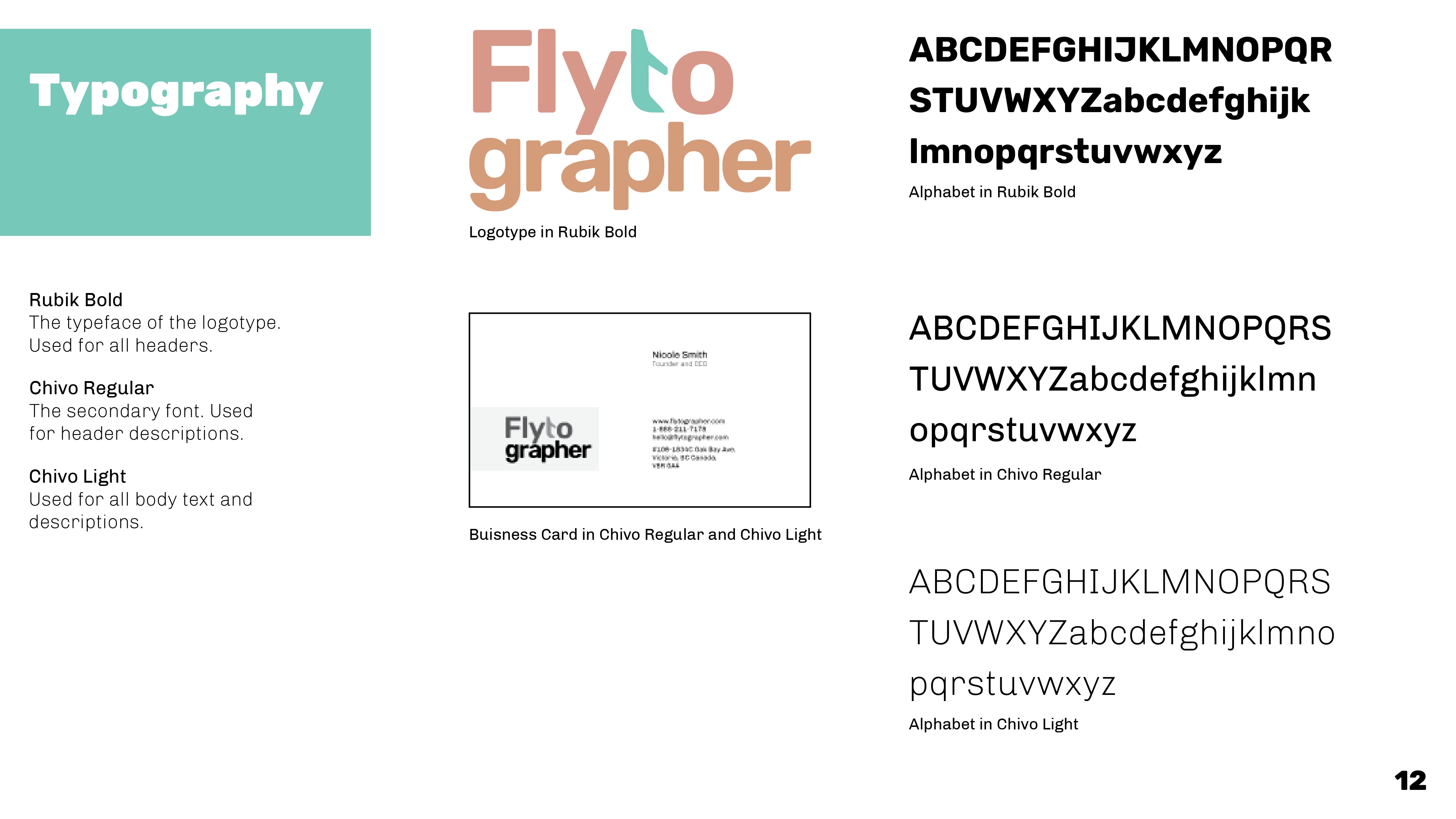
Typography Exploration
I first experimented with different types and fonts. I wanted a type that was bold and simple for anyone to read. I also wanted it to look casual and welcoming, as it was to represent a travel company. I decided to choose Rubik Bold, not one of the options in the list below, though from the same type family as Rubik Regular and Rubik Light.

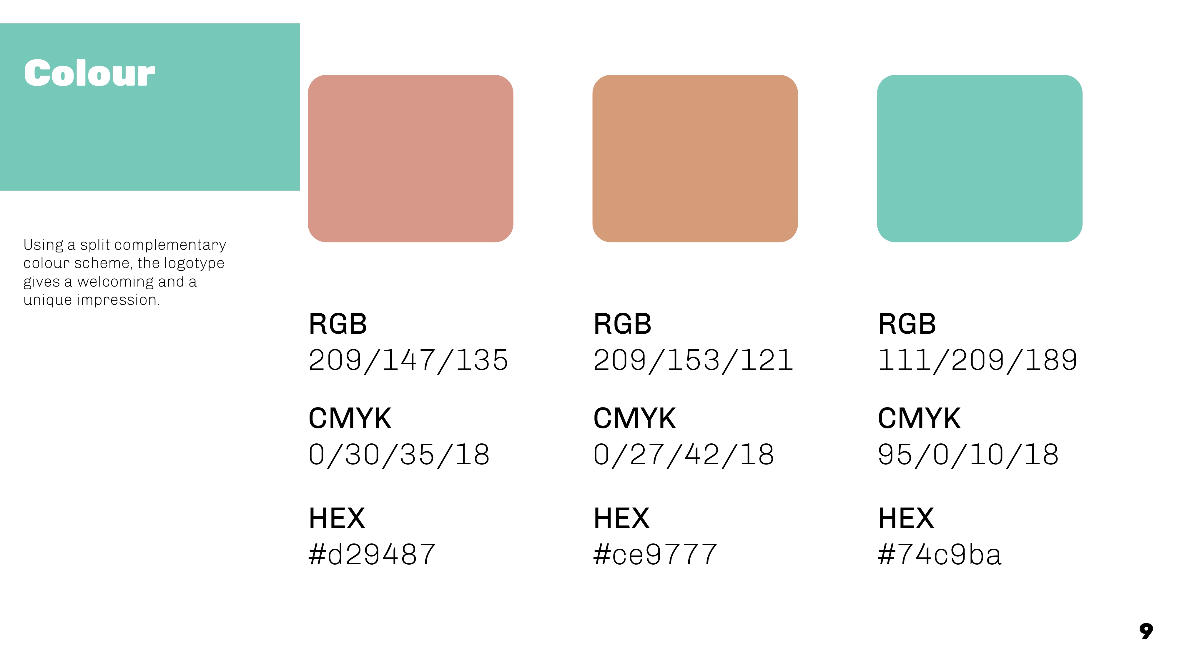
Colour Exploration
I really enjoy playing with colours, so creating one single colour scheme was difficult. Many of the variations were too dark for a company that was about creating happy and light memories. I settled on a neutral colour palette with a complementary emphasis on the altered ‘t’, the middle colour scheme.
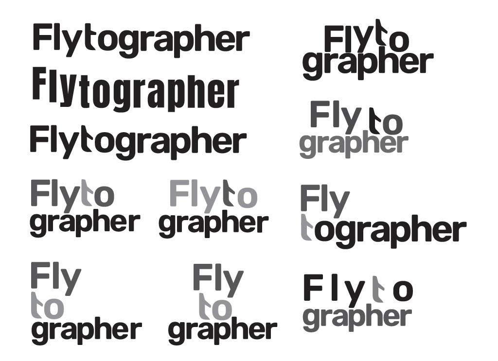
Type Layout Exploration
I struggled with the layout of the text. I first experimented with different ways to lay out the text horizontally. I wasn’t satisfied with the results because I felt that the word Flytographer was too long and would look awkward on other materials such as websites and merchandise. I was then advised to break up the word and stack them vertically, adding more balance to the logotype. I chose to stack it in way that was asymmetrical but still balanced with the colour tones.
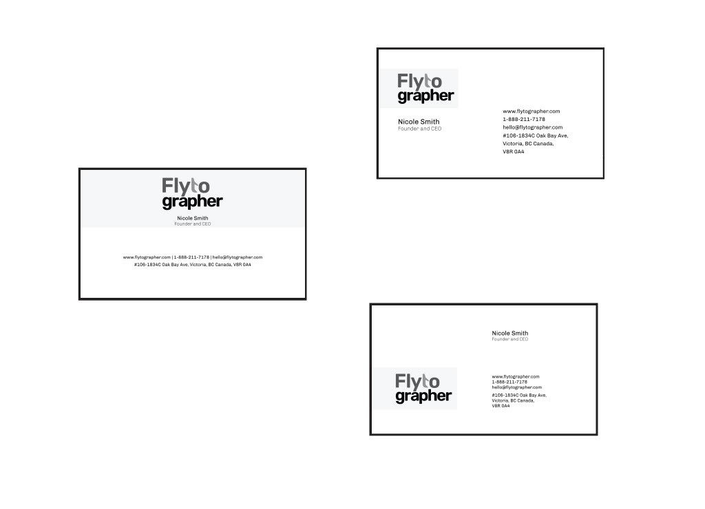
Business Card Exploration
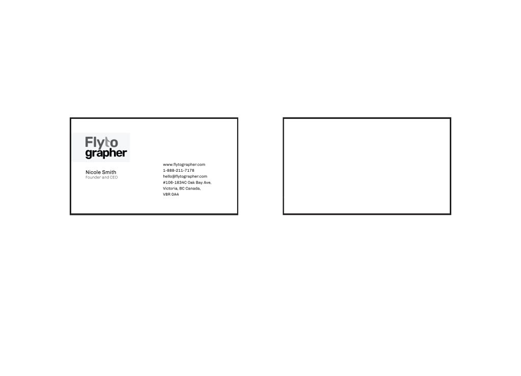
Business Card Final
Similar to the logotype, I wanted the business card and letterhead to have simple shapes and a simple layout. I experimented with different ways to build a box around the logotype. I knew that I wanted the logotype to be on the left and have a majority of the text on the right to keep it balanced.
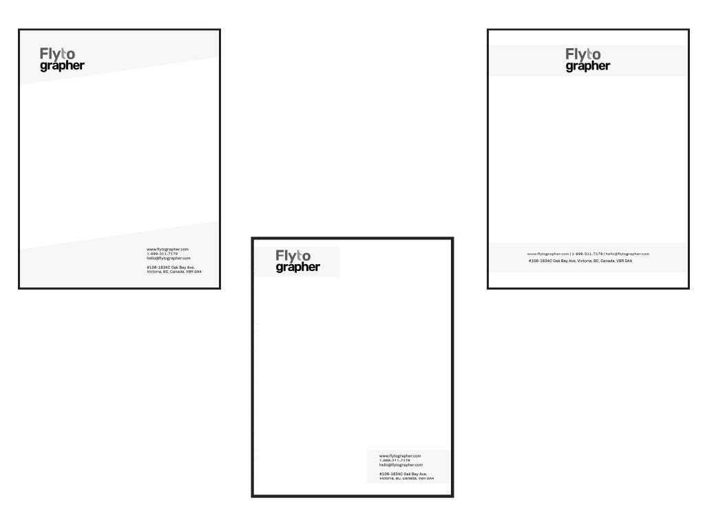
Letterhead Exploration
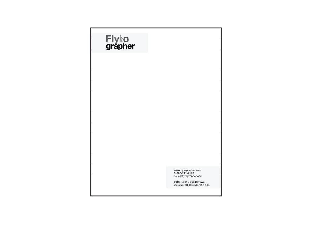
Letterhead Final
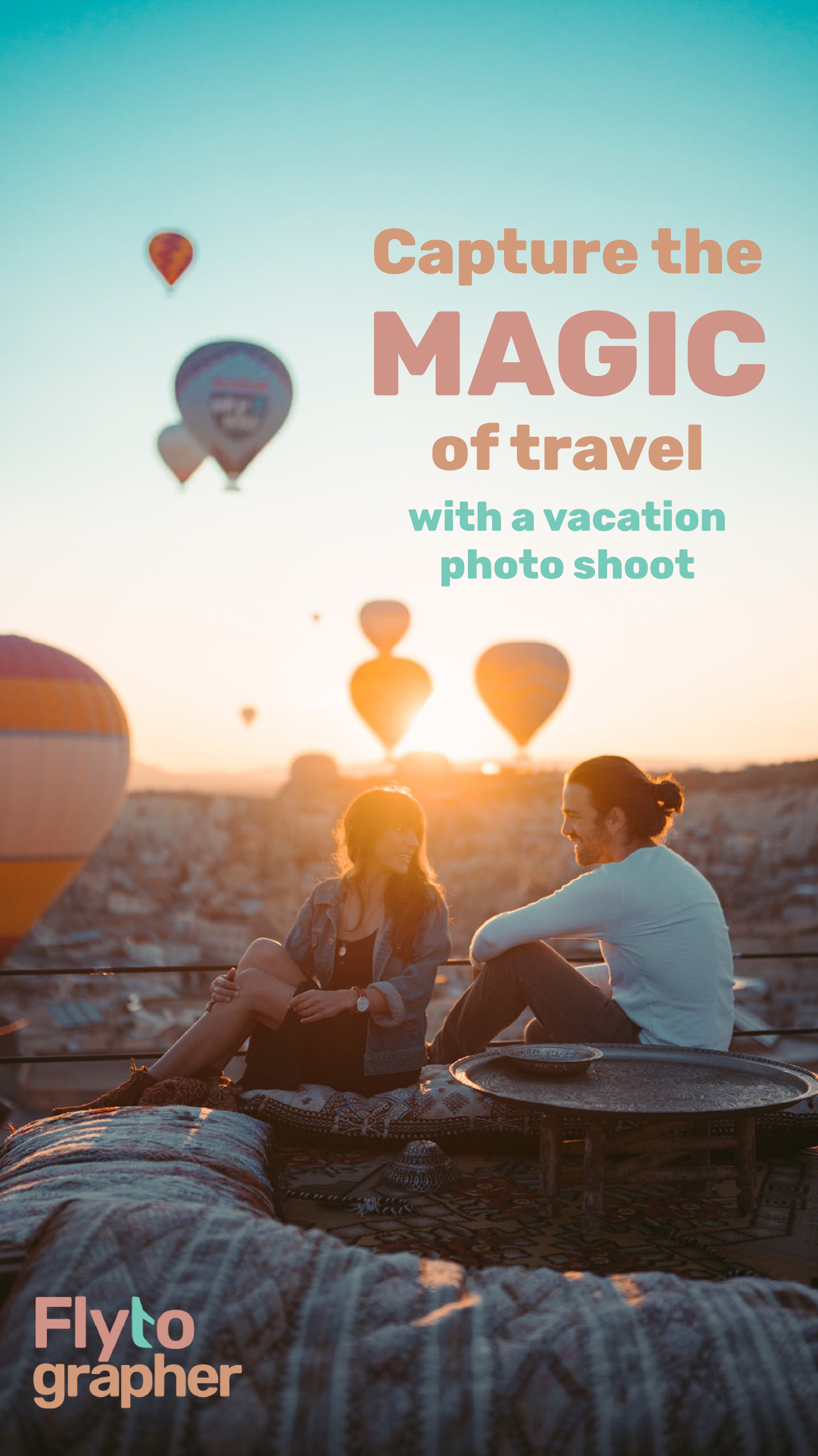
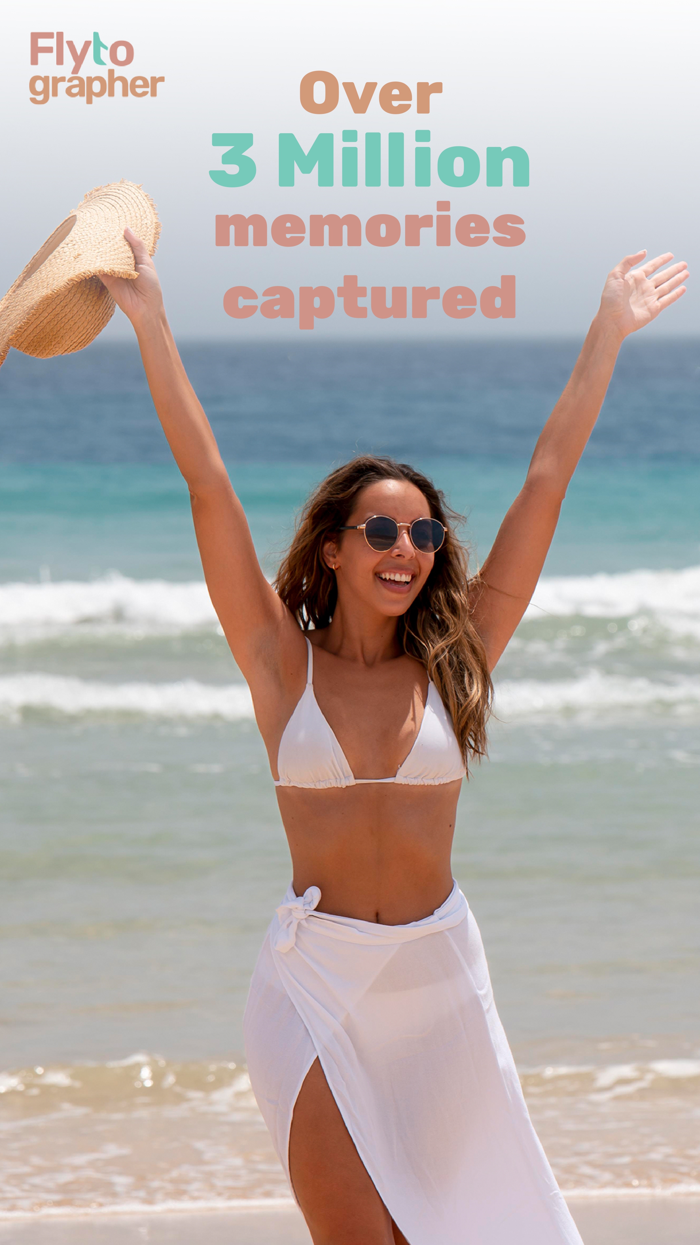
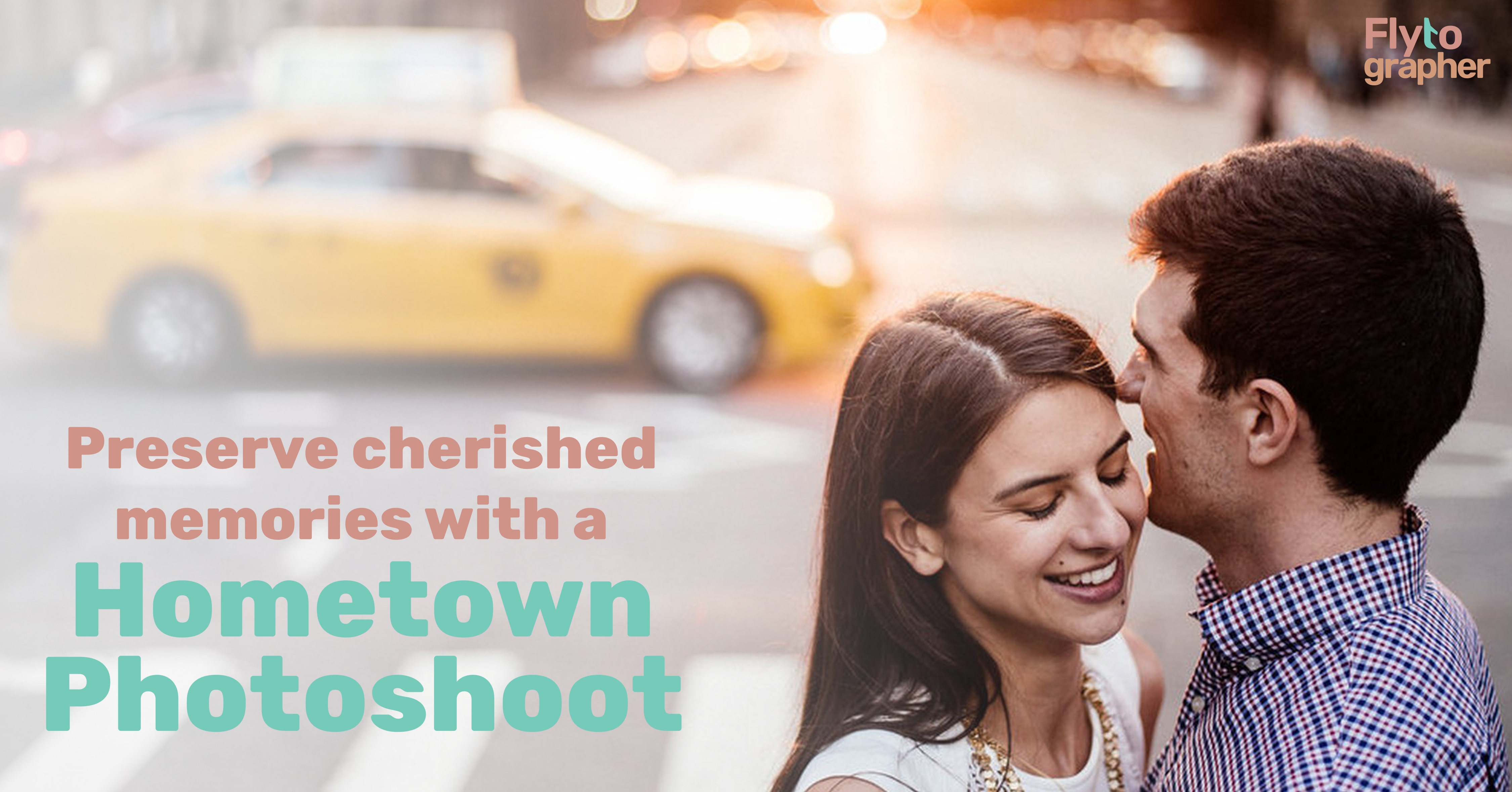
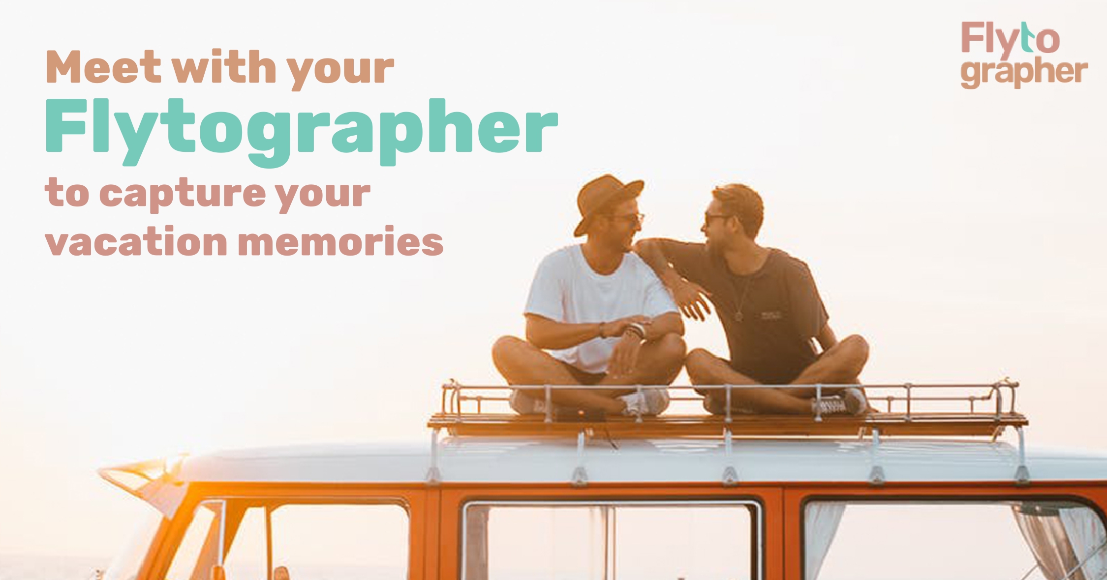
All the social media posts were made to promote the fun, happy adventures clients have or will experience when working with Flytographer. Using the split complementary colour palette, the photographs also match the colour scheme while still showing a variety of vacation spots.
As a final project, I created a branding book of all my design ideations and variations, as well as the concepts behind the logotype and colours.
Pages from Brand book
This project immensely helped me with learning about colour theory, logotype building, and how to express a brand identity. I also learned technical skills such as using Photoshop and Illustrator to create typography and manipulate letters, such as the ‘t’ in Flytographer.
If I were to redo this project, I would spend more time with the colour choice. Although I like the final colour palette, I think using colours that have more meaning to the brand identity, rather than colours that look nice together would be more effective.