Time
2 months
Software
Adobe Photoshop, After Effects, Premiere Pro, Microsoft Sway
Roles
Art director, graphic designer, video editor, videographer
Context
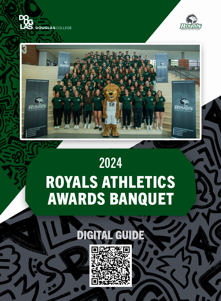
Douglas College’s Athletics Banquet is an annual event to celebrate the athletes of the Douglas Royals and the end of their sports seasons. The event consists of dinner, awards given, and much photography and videography. I was in charge of developing the visual style of the event’s content and utilizing it in almost every piece of media showcased in the event. I also filmed and edited video interviews of the athletes during the event.
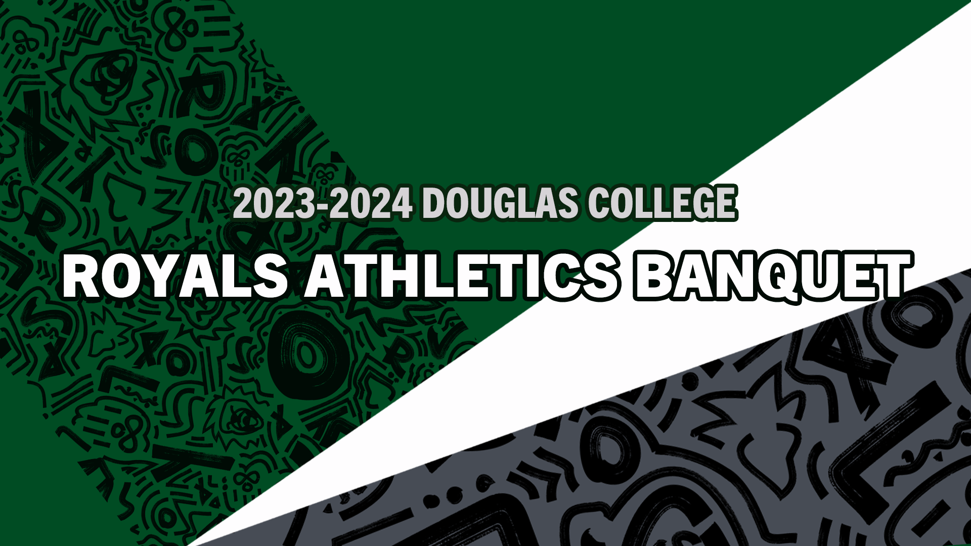
Slides were needed for each portion of the events. I developed a unique and recognizable background for all of the graphic and video content delivered for the final event. I developed this background using the slides as my first deliverable, then implemented it on all other pieces of content.
First draft of the style
I initially struggled to come up with a style for the slides. I wanted it to be simple, but I also knew that it should be more visually interesting and unique.
Second draft of the style
I experimented with different branding resources, such as patterned grey and white backgrounds and white stripes. Although I liked this design, it wasn’t functional for slides with more content, as it was too visually heavy at the bottom.
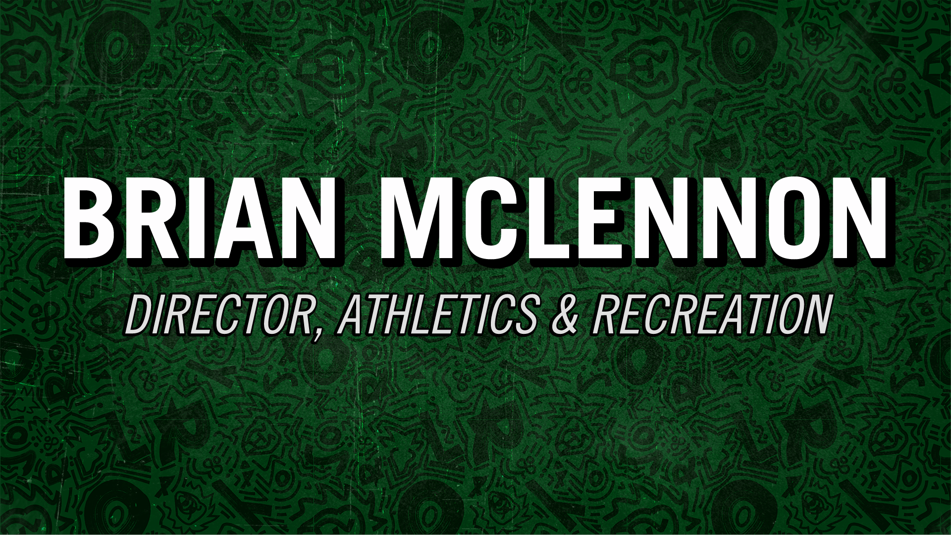
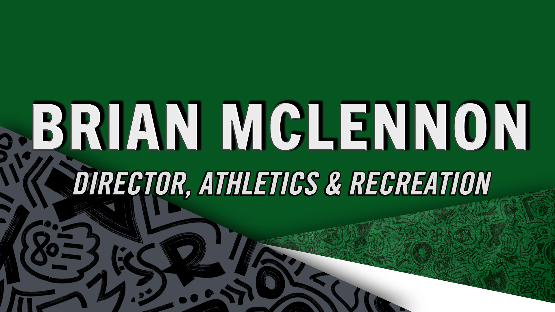
Final draft of the style
I settled on this design, with the secondary colours white and grey on the right, and the primary green on the left. It was also more balanced in pattern, making it to be sensible for any type of content to go on top of it.
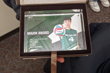
6 glass awards were given to those who received major awards. I designed them to be almost identical to the holding screens, so that the winners would be reminiscent of the event where they were given.
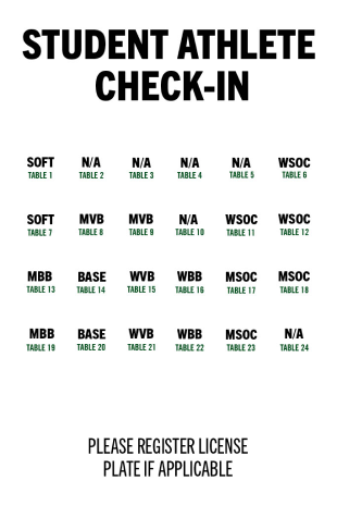
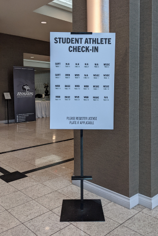
To help guide the athletes in their seating, a check-in poster was designed to be placed at the entrance of the venue. It includes the seating for all athletes and staff.
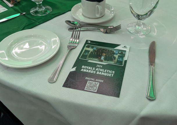
I designed table cards to be placed at all seats at the tables. The design was kept within the visual identity, with the unique colourful background and green title plate. I was concerned that the picture would not translate well into print, as the quality wasn’t the best, but it wasn’t noticeable in the end.
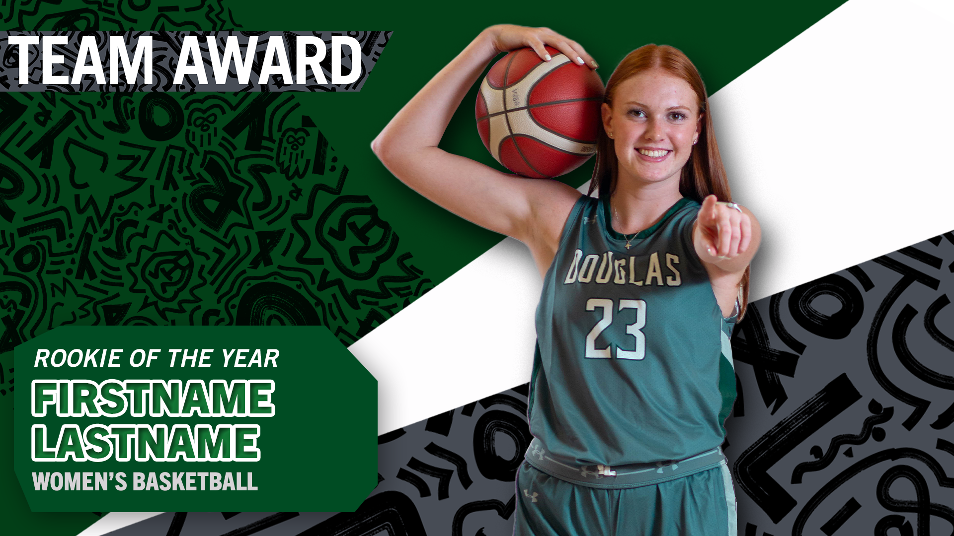
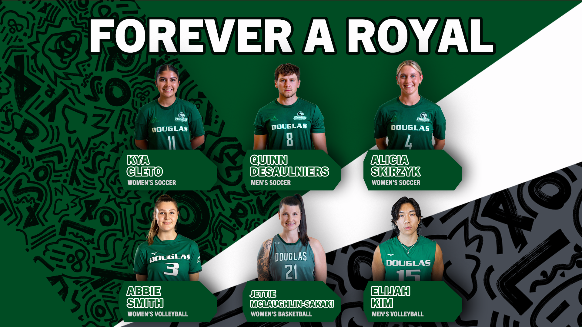
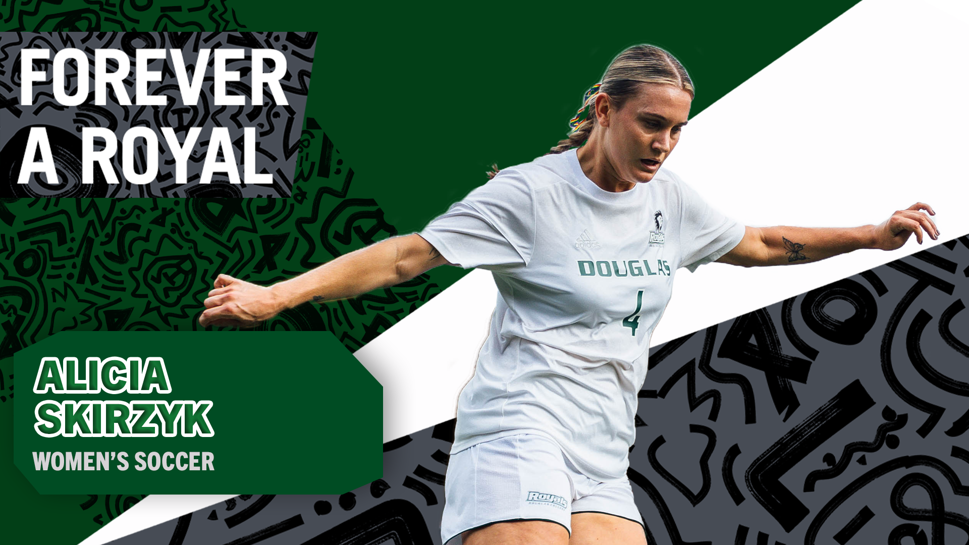
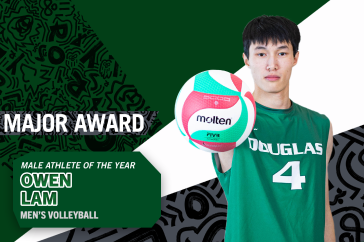
Implementing the visual identity, holding screens were required for over 15 videos of individual athletes’ awards. These would be used at the end of athlete montage videos, along with the green nameplates I designed on the bottom left, and award banners on the top left.
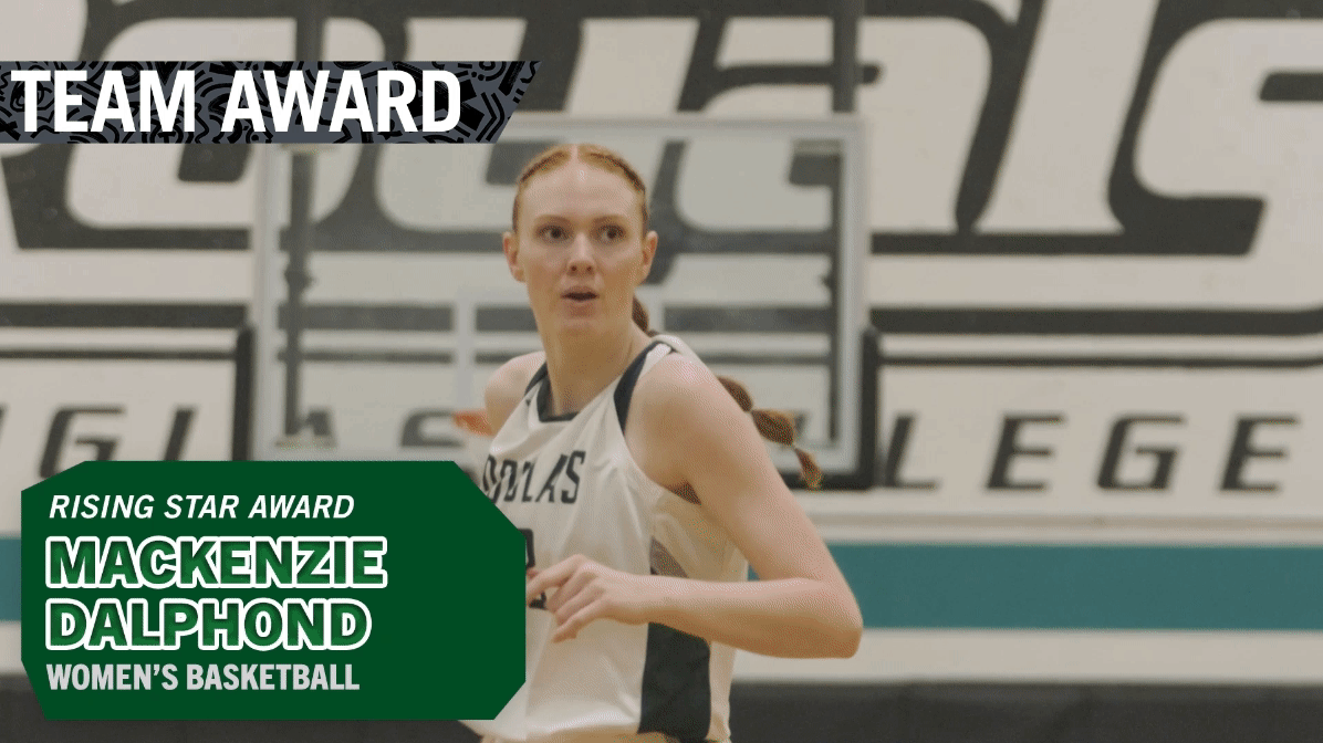
Women’s Basketball: Major award for Mackenzie
During the banquet, over 20 awards were given throughout all of the sports teams. For each award given, a short video montage that showcased clips of the winning athlete’s scores, their relationships with their teammates, and other b-roll. I was in charge of creating videos for all of the men’s and women’s basketball teams.
Men’s Basketball: Season’s Recap
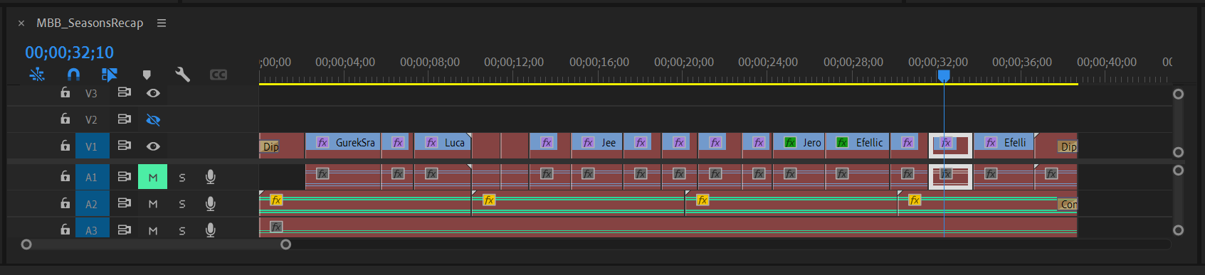
Video editing timeline in Premiere Pro
For most of the videos, I struggled with editing all the clips together to be around 15 seconds long. At first, I felt like I was removing important parts of the video that gave the main points of action context. For example, for a clip of the athlete shooting a basketball hoop, I would have to remove the parts before and after the shoot, such as them dribbling the ball, in order to save time.
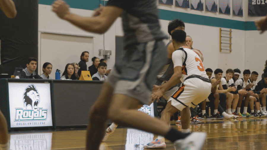
GIF from MBB Seasons Recap
I learned that because these videos had to be very short, the action shots were the only parts necessary to keep. I wanted the viewers to feel inspired, impressed, and hyped up for the energy and passion that the athletes showed-this would be harder to show with shots of them slowly walking or generally not being active.
At the beginning of the event, various student athletes were filmed for “red carpet” style interviews. We changed the name to “Green Carpet” to match the main green the Douglas Royals use. Using a phone as a video recorder and a microphone attached to the phone, I filmed all of the interviews. Later, I edited together over half an hour of footage into a 3.5 minute video for the Douglas Royals’ YouTube channel. I also edited 2 additional videos for promotion: a 25 second teaser and a 40 second preview-both of which are viewable on the Douglas Royals Instagram account.
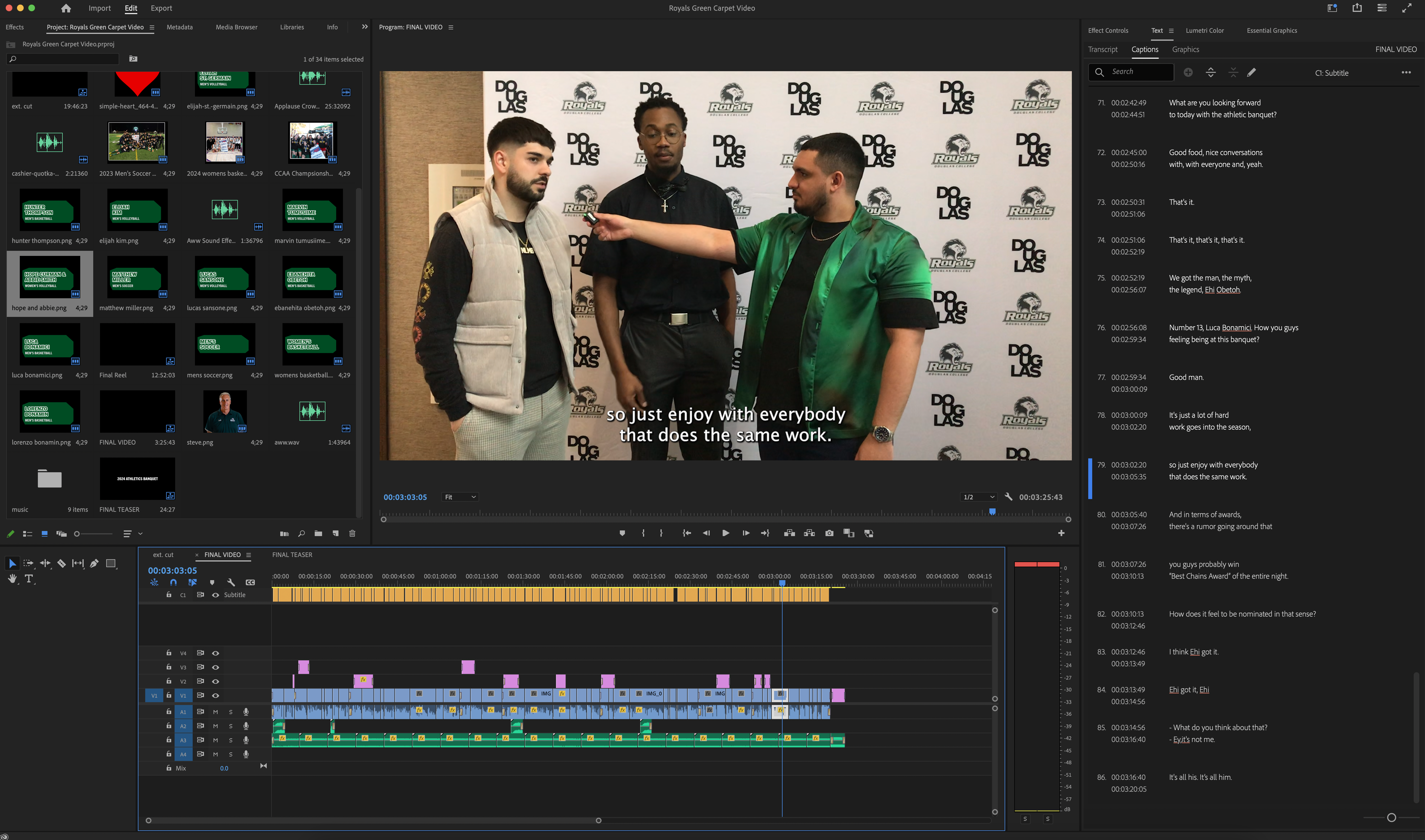
Editing the video captions on Premiere Pro
Similar to the video montages, I had trouble editing down lots of footage into a single, short video. There was over 30 minutes of interview footage in total, which meant I unfortunately had to completely remove some people's interviews. This was because they either didn't have the excited, upbeat energy as the other interviewees, or their conversation wasn't as unique or interesting.
By far, this project has given me the most experience in terms of graphic design, art direction, design implementation, print design, videography, and video editing. I learned how to implement a specific visual identity into different forms of media such as videos, posters, physical awards, and slide decks, while still making them unique in their own way.
I also learned how to condense lots of video footage into short montages, especially with the video interviews. There were many clips that I had to remove from the final video simply because they would take up too much time. I had to learn how to pick and choose which interviews were “necessary” by deciding if the energy the interviewees gave were high enough, if what they talked about was interesting and unique, and if the interview fit with the rest of the interviews to create a cohesive video.
Time
4 months
Software
Adobe Photoshop, Adobe Illustrator, Adobe InDesign, Microsoft Sway
Roles
Art director, Graphic Designer
Context
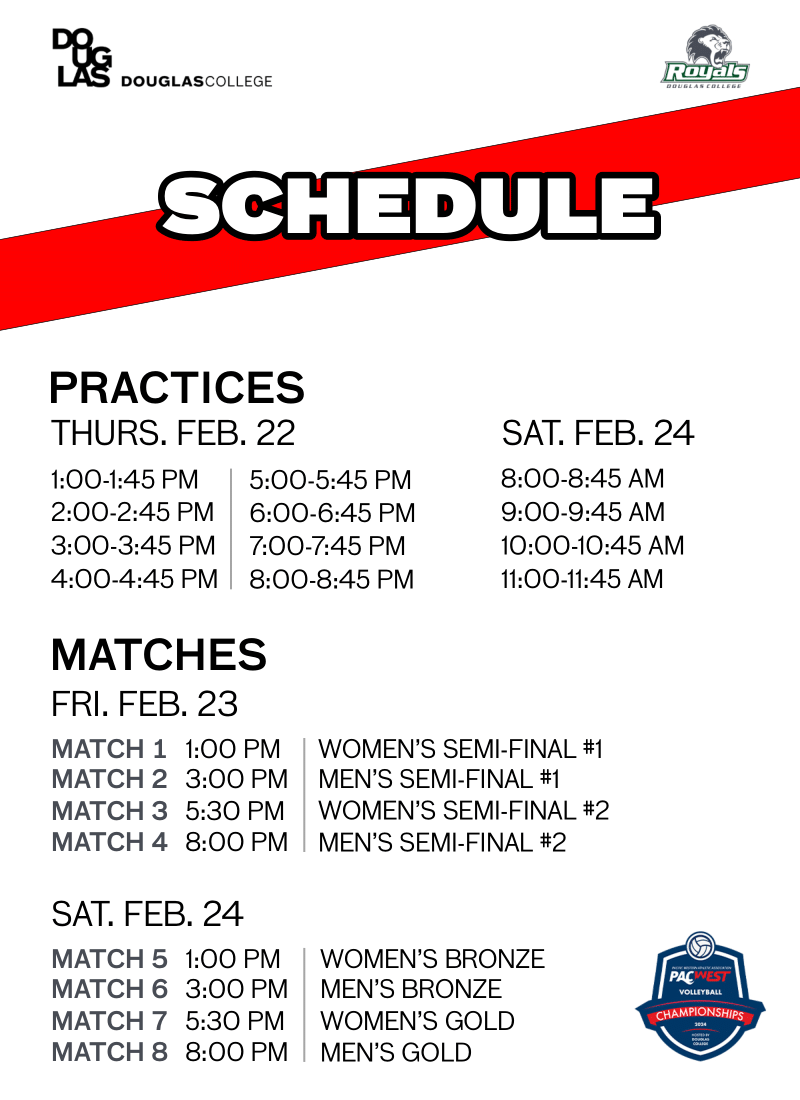
The PACWEST Volleyball Championships is a volleyball event involving multiple post-secondary institutions in British Columbia. This year (2024), Douglas College hosted the championship, automatically entering both their women's and men's volleyball teams into the event. I designed and developed a visual identity for the event's print and digital materials, including posters, score templates, and ID badges.
Twitter Post
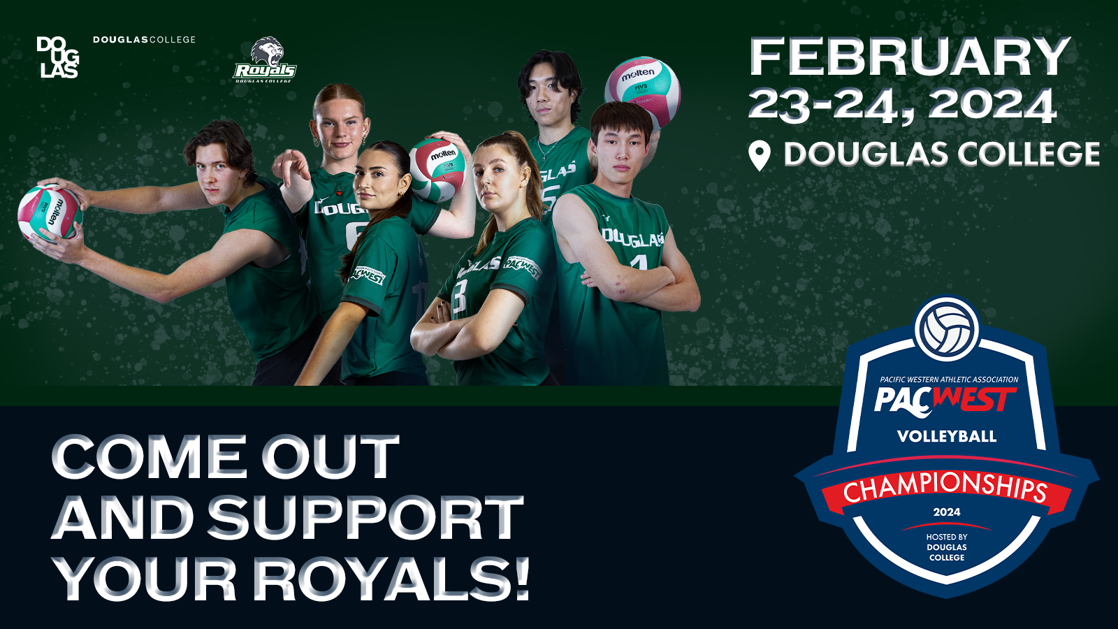
Promotional media was needed for various social media such as Twitter and Instagram. Our goal was to feature many student athletes to boost engagement and shares for our posts. We also wanted key information such as the dates and location of the championship to be clearly visible.
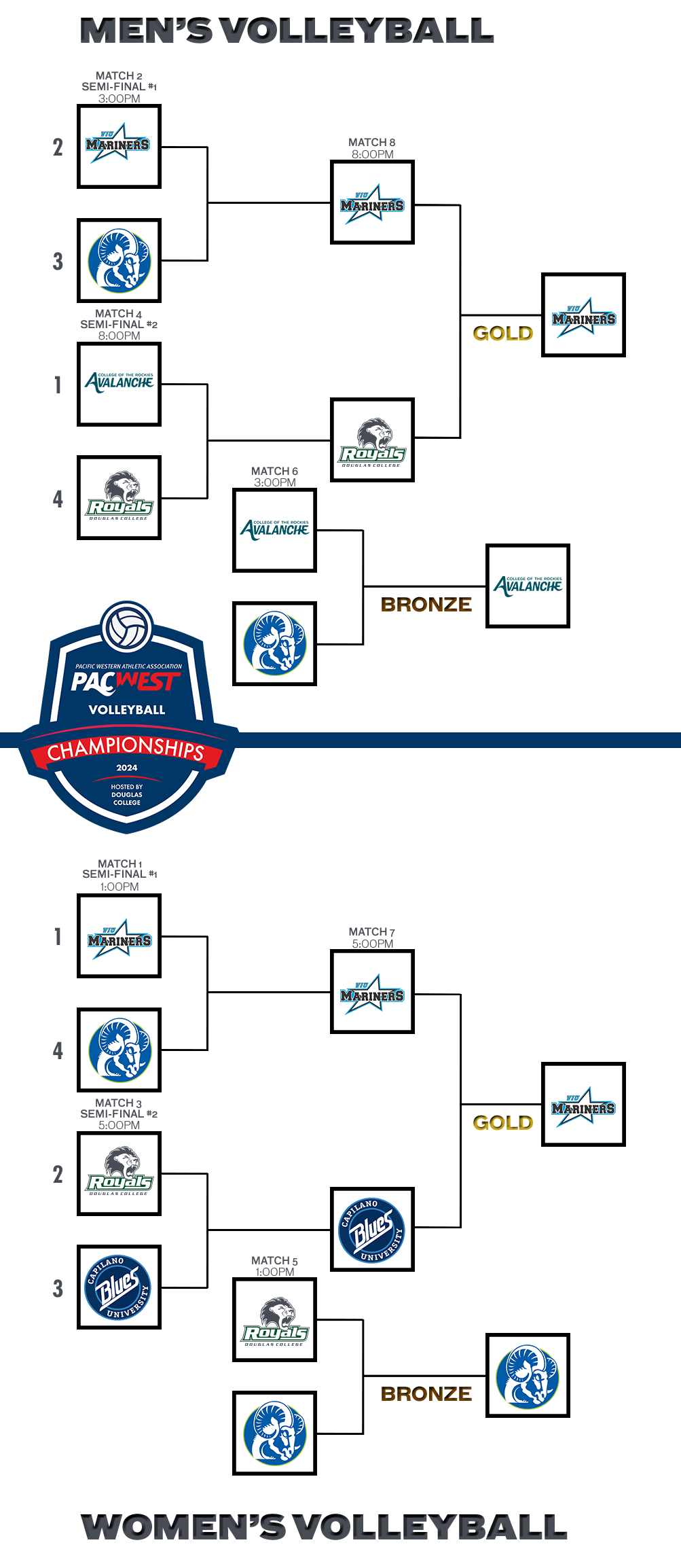
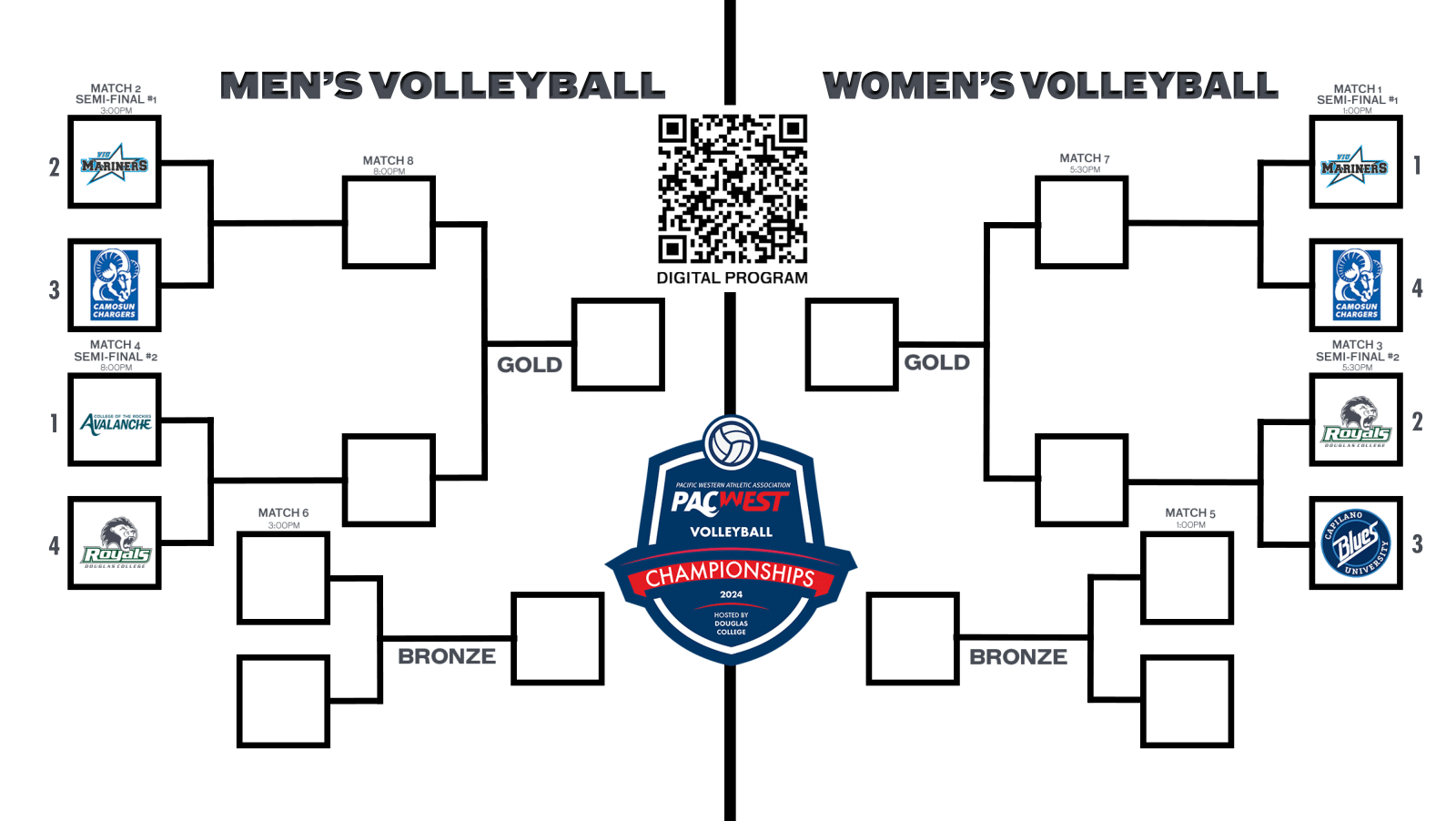
Program Guide Bracket
Adapted for a smartphone, the sports bracket was designed for both men’s and women’s volleyball championships. The goal was to make the bracket easy to read and digest by using common bracket design features such as squares of logos and lines to connect the teams to the games they’d play. The challenge was to still keep that familiarity, while making it accessible for phone sizes. The digital program guide was designed to be viewed on a mobile device.
Final Draft
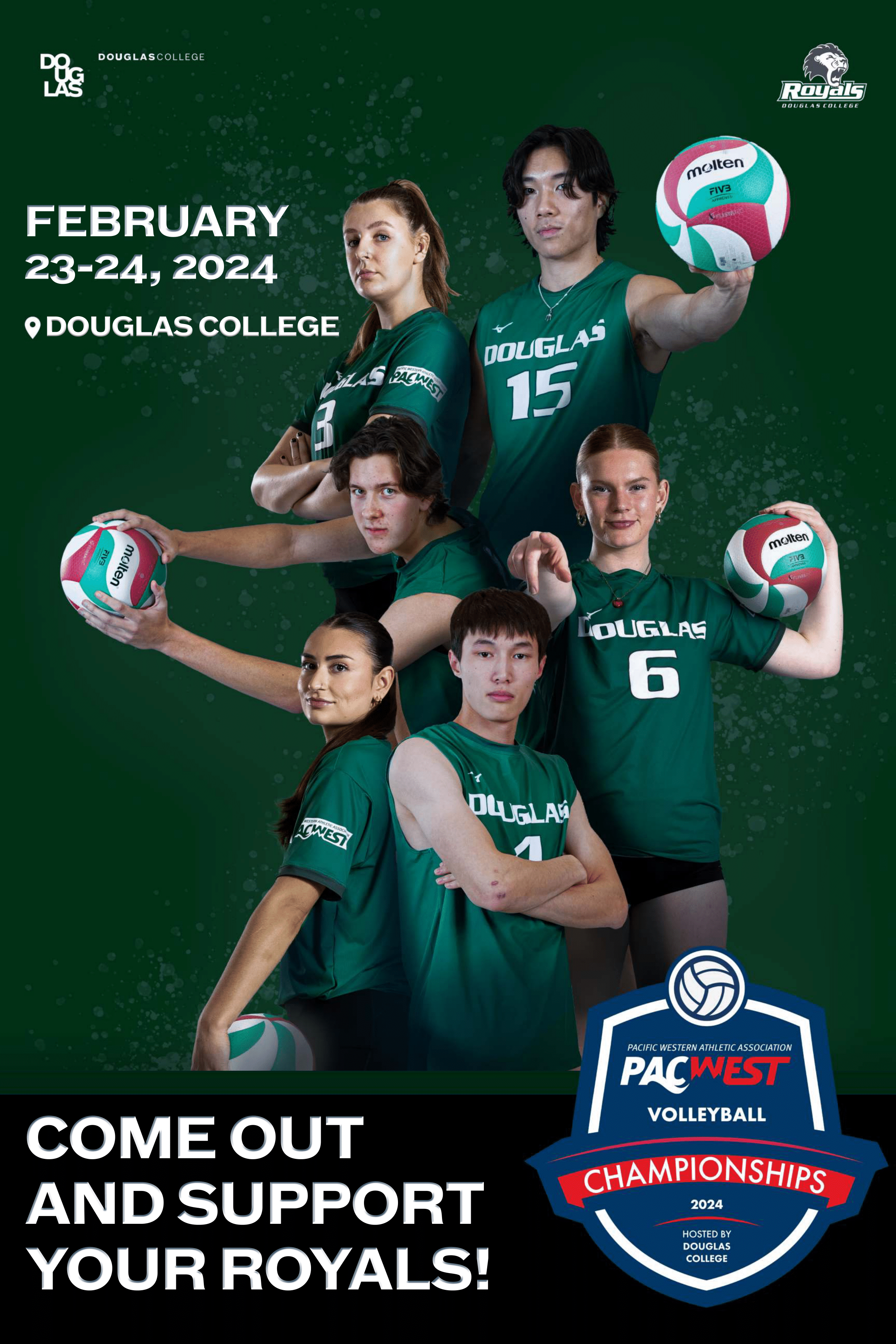
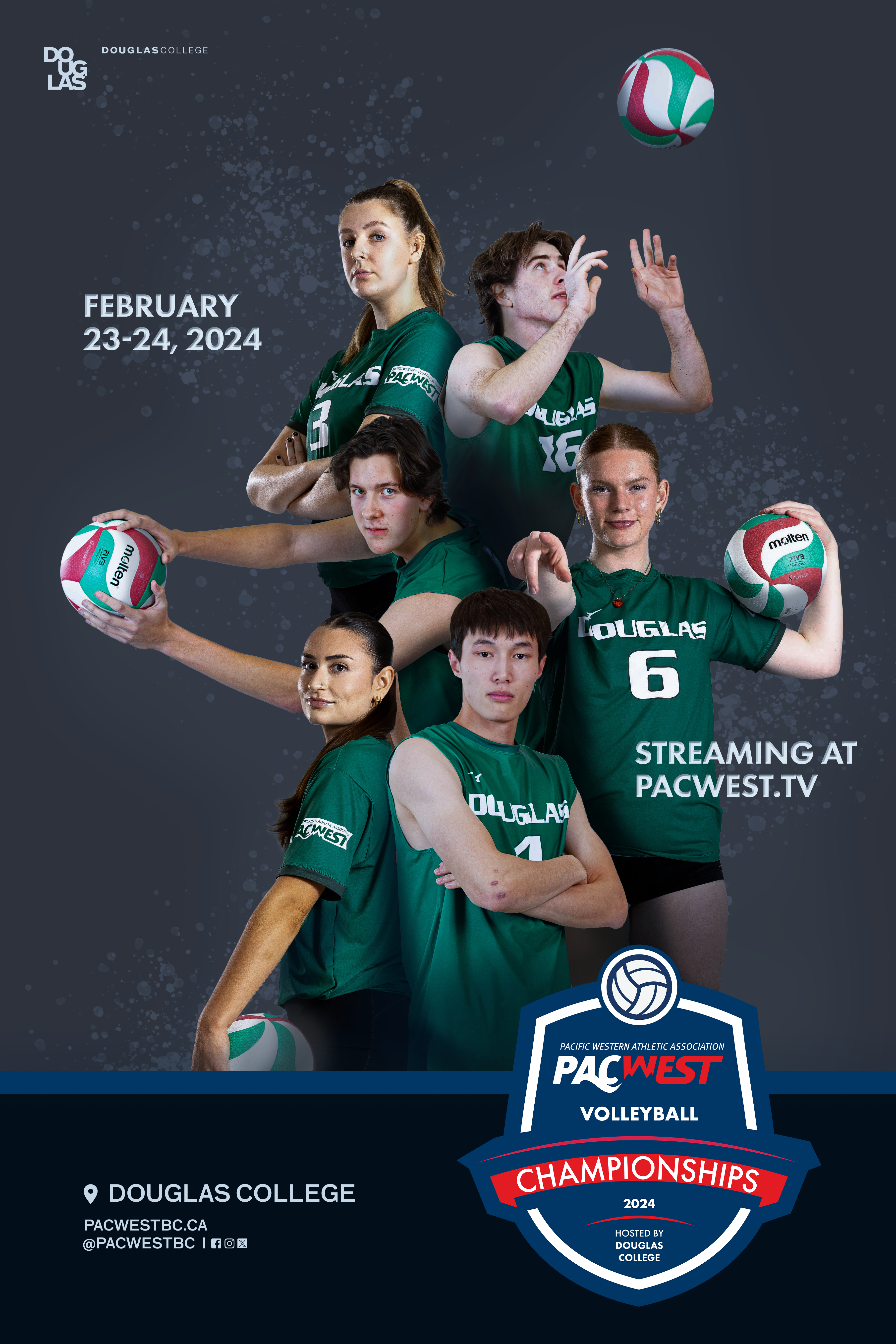
Physical posters were designed to be put up around campus, promoting the event and showcasing some of the athletes participating. The athletes were arranged in a way to create a slight curve towards the right. This was to give the columns of athletes more visual interest, and allow plenty of space for the left athlete holding out the volleyball.
First Draft
The first draft was my initial take of the event: professional and clean, and dramatic. I focused on creating clear hierarchy and a clear eyeline, from the date and logo, to the athletes, to the streaming website, then the location and social medias at the bottom. I also wanted to choose athlete poses that were all different from each other, showcased an equal number of athletes from the men’s and women’s teams, and took up a good amount of space on the page.
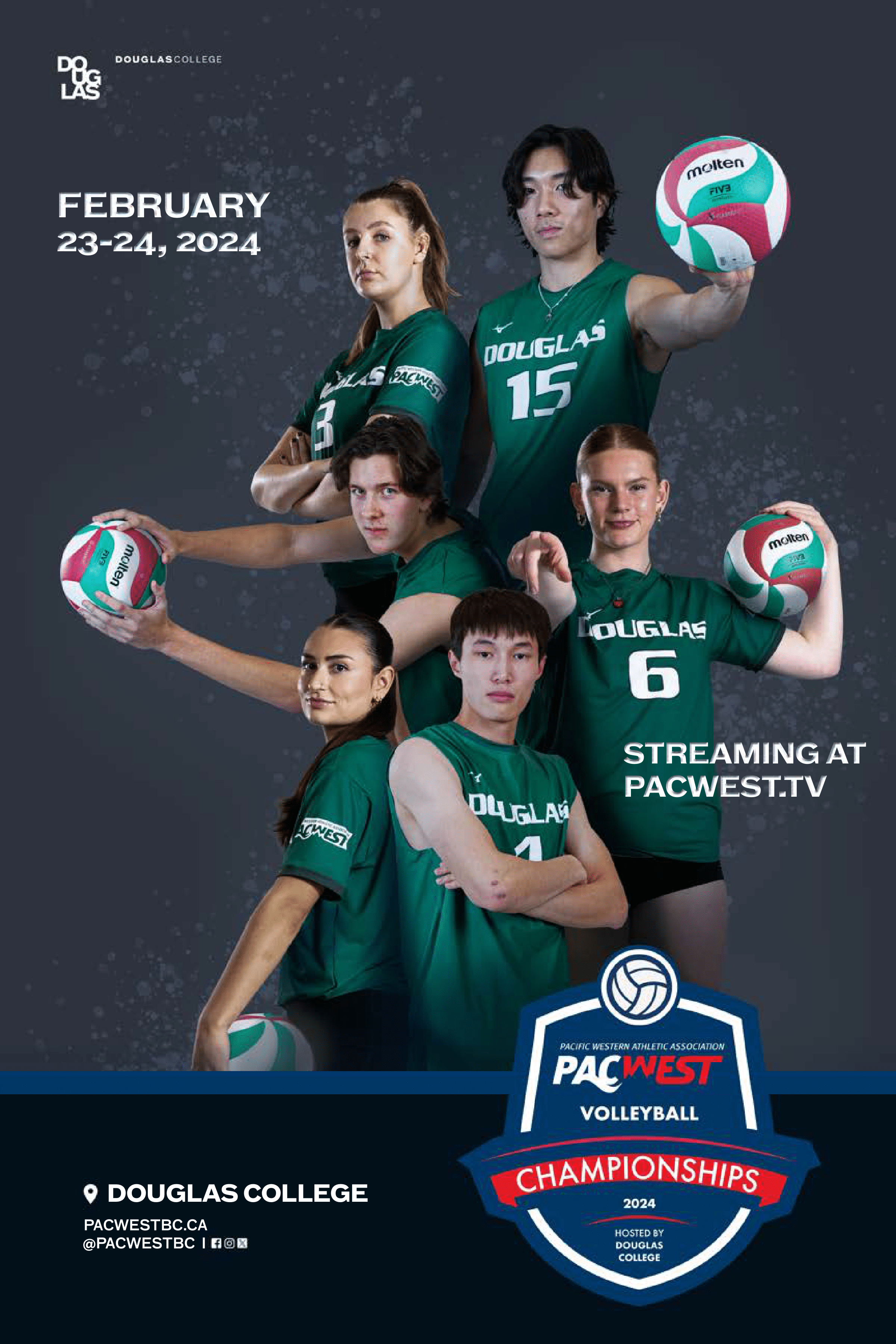
Second Draft
The second draft involved a change of the top right athlete due to team roster changes. I also changed all the text and icons to white to be cohesive with the PACWEST championships logo.
After feedback, the poster became more casual with a change to a simple line of text on the bottom bar, and the relocation and resizing of the date and location. The background was also changed to green to align with the athletic program’s branding colours.
Bracket
A large bracket was required for both 6 ft x 3ft and 4 ft x 2ft prints. They were put up in the athletes hotel and the event’s gym entrance. The blank squares were filled during the event with stickers of the logos. The seed number was also requested to be featured with the team’s logo.
Front
Back
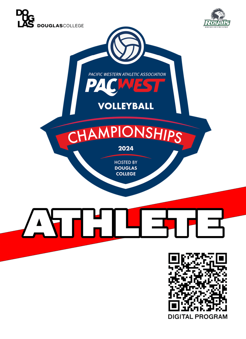
Double sided ID badges were designed to be worn by staff, athletes (left), and VIP members. The challenge was to fit lots of information on the back, while staying brief yet understandable in the dates and times. I used hierarchy and blocking of information to achieve this.
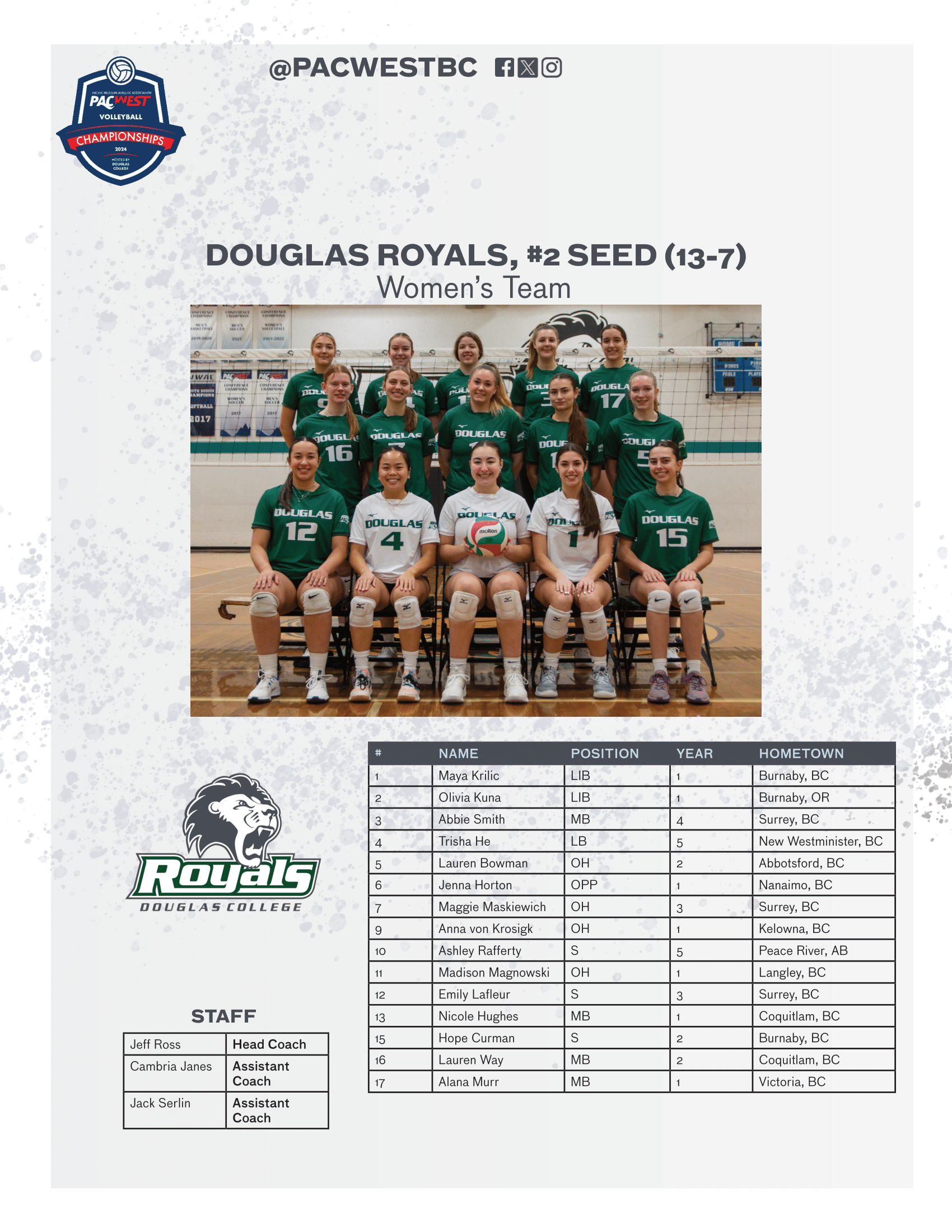
Douglas Royals Women's Volleyball Roster
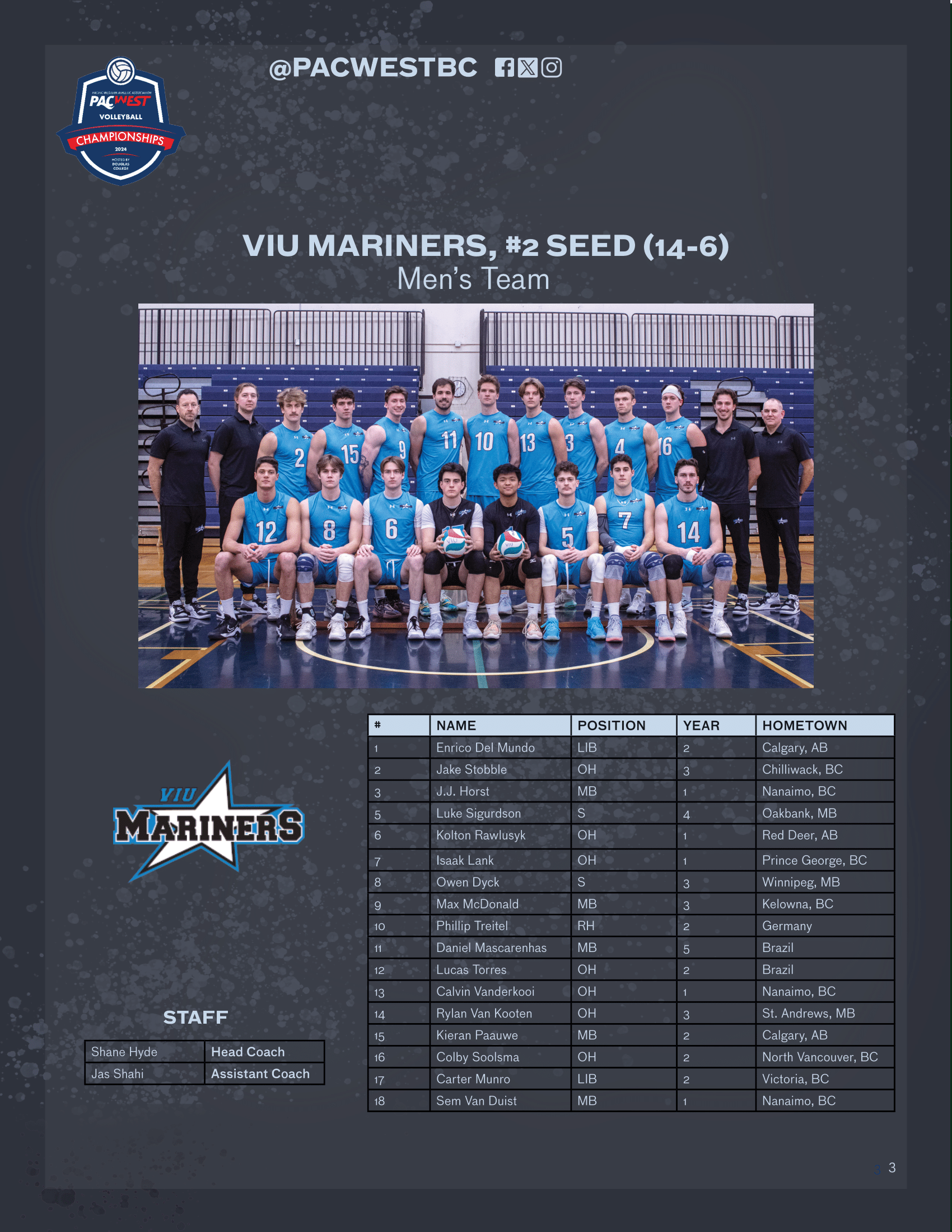
VIU Mariners Men's Volleyball Roster
A program guide of the team’s rosters, brackets, and sponsors, was designed in Adobe InDesign. Keeping with the same theme of the poster, the backgrounds of the pages alternate between a light and dark sprayed deign. The program guide condenses each team into individual pages. It was a challenge to fit lots of information onto a single page. I didn't want to list of athletes to take up too much space or interfere too much with the rest of the page's hierarchy.
Use imagery. Show athletes, logos, patterns, use as much as necessary, because people generally want to see that over lots of text. Instagram was a great indicator of this, there was more engagement and comments on a post when athletes were included in the graphic, such as the event poster and final scores. I also expanded my knowledge in designing smaller merch, such as the ID badges. The badges were approximately 4 x 6 inches, and I often overestimated how large I needed to make the text. I wasn't confident that the schedule information was readable, as it was condensed quite a bit into a small section. However, I was pleasantly surprised to see how readable the text was. I learned that using measuring tools in real life help greatly with determining how graphics will look on paper.
Creating graphics for a large event to be perceived by many requires a recognizable and consistent visual branding, involving colours, typography, and layout of elements. I practiced this heavily by creating many different graphics with the same elements, and still making them unique and not monotonous.
Time
1 month
Software
Adobe Photoshop, Adobe Illustrator, After Effects
Roles
Graphic designer, motion graphics artist
Context
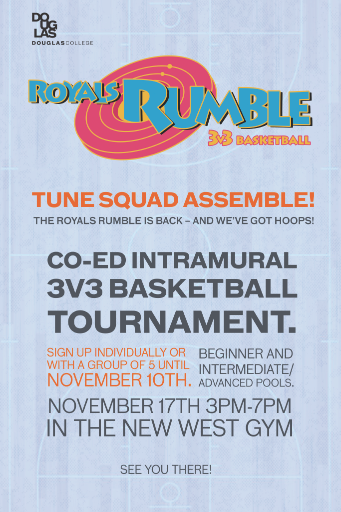
Royals Rumble was a one day basketball intramurals event hosted by Douglas College's recreation department. The direction given was to make the visual identity reminiscent of "Space Jam (1996)", a movie about basketball, while still maintaining the recreation department's branding colours. I created and animated a logo, and designed a promotional poster and social media story.
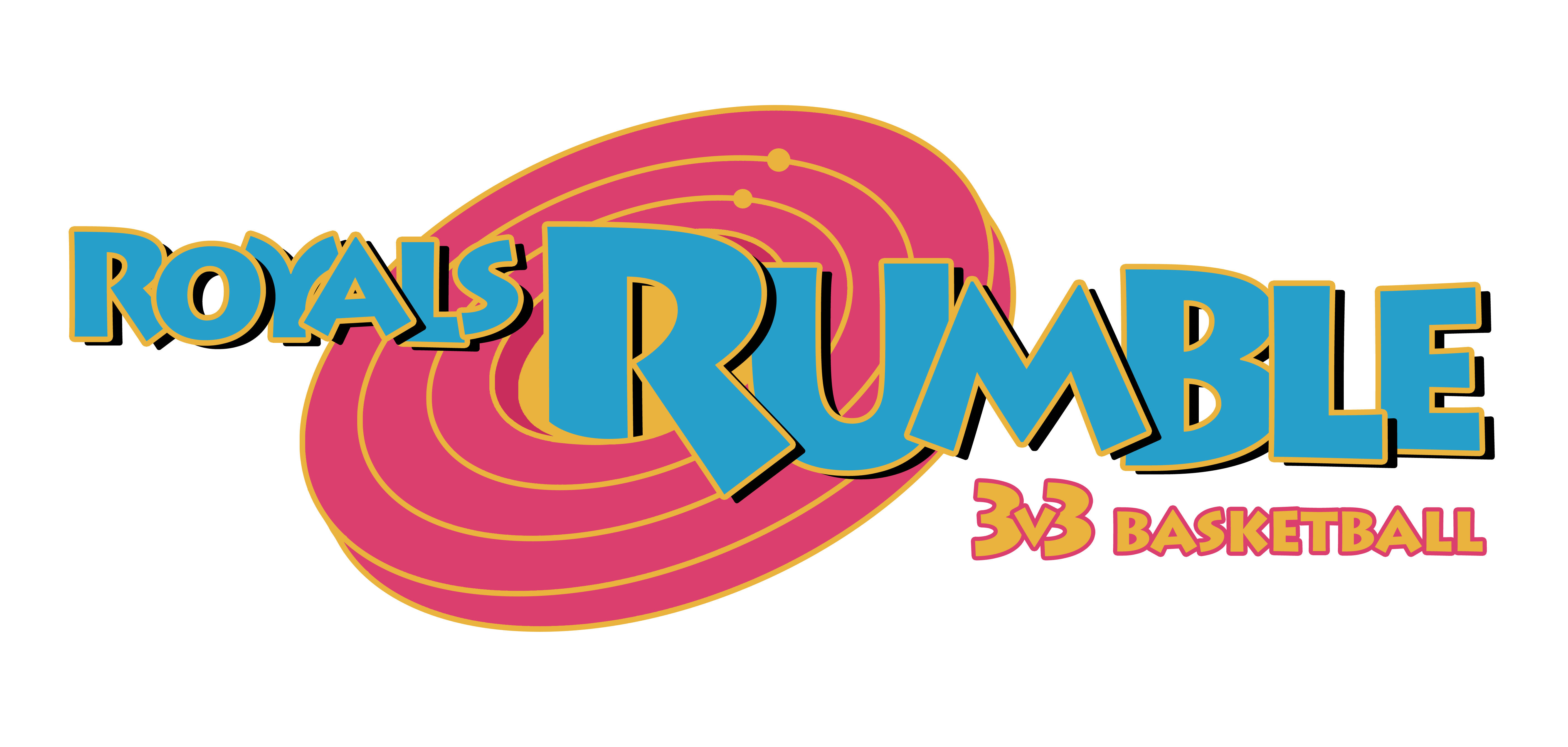
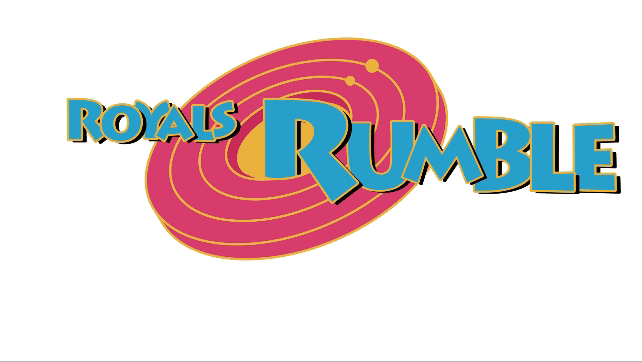
Final Logo
Promotional media was needed for various social media such as Twitter and Instagram. Our goal was to feature many student athletes to boost engagement and shares for our posts. We also wanted key information such as the dates and location of the championships to be clearly visible.
Space Jam Logo
The event was based on the live action and animated movie, “Space Jam”. For promotional material, I challenged myself to recreate the Space Jam logo with the recreation department’s branding colours and event name, “Royals Rumble”. I worked in in both Adobe Photoshop and Illustrator.
Animated Logo GIF
I created an animated GIF of the logo in After Effects for video content. The small yellow circles are constantly rotating, giving the image visual interest, and the scaling letters draw attention to the name of the event.
Draft 1
The first draft of the logo is almost identical to the Space Jam logo. It was good, but it didn’t represent basketball or the event enough.
Draft 2
Draft 2 included a 3v3 basketball type, as well as the R looking like a basketball. The orange of the R, although it represented basketball in the logo better, was ultimately scrapped as it was too similar to the pink and yellow surrounding it.
Draft 3
Draft 4
Draft 3 and 4 were experiments in exaggerating different aspects of the shapes. Draft 3 included a basketball net behind the hoops, but it made the silhouette of the logo too unclear. Draft 4 has an extended R, but looked too awkward and unbalanced.
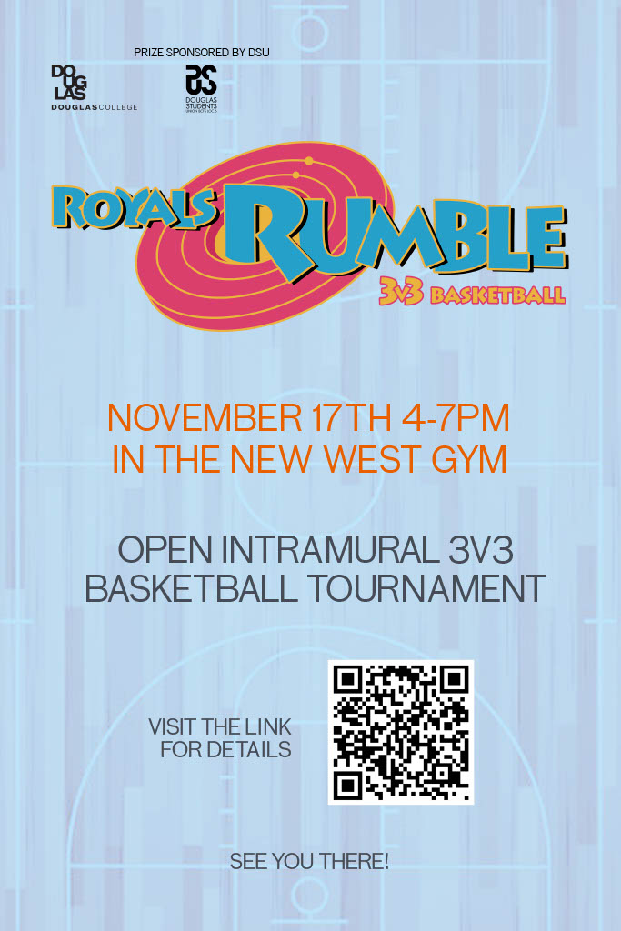
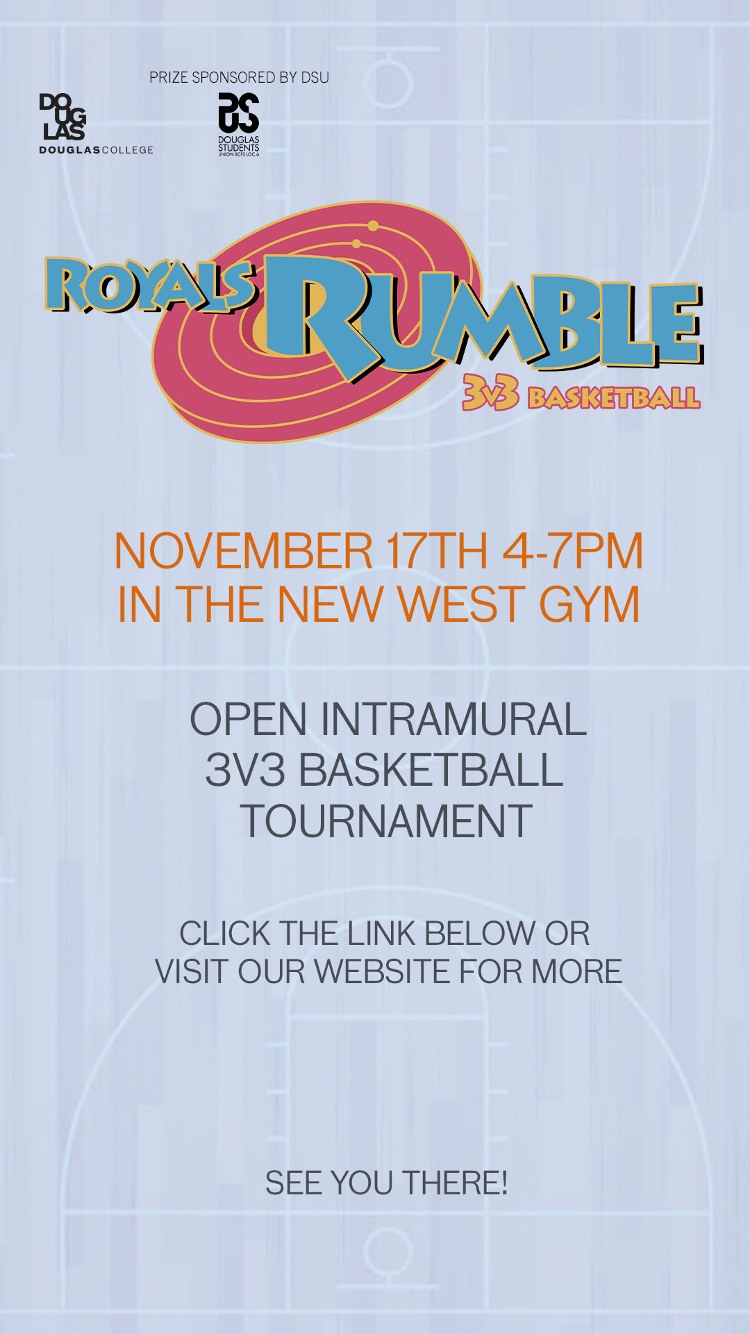
Physical Poster
Instagram Story
I designed a poster to be printed and put around campus, and an adapted graphic to be posted as an Instagram story. The goal was to make the poster look like it was a basketball event without too much reading, and to have a simple, easily readable layout.
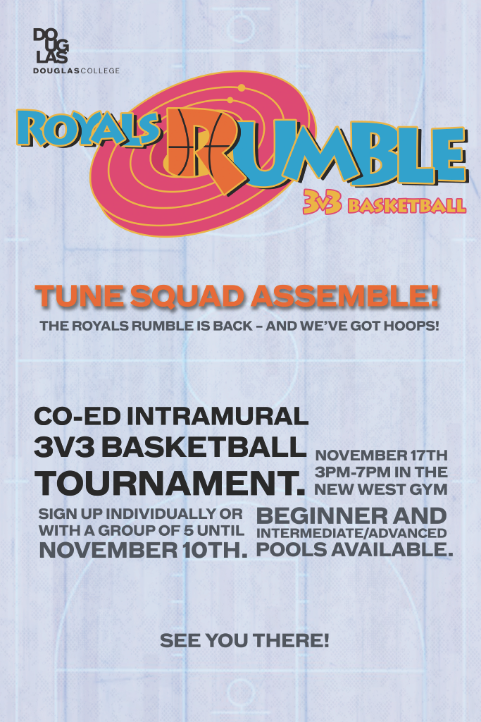
Draft 1
Draft 2
The first and second drafts of the poster were made of blocky text and less white space.
Draft 1 had text that was made up of all medium or bold fonts. I realized that this was not only difficult to read, but it made the hierarchy harder to determine. An old version of the logo was used, but was changed to increase readability and accessibility. The logo was also scaled too big, with too little room on the left and right sides.
Draft 2 softened many of the critique of the first draft. The text colour was changed from black to grey, and the grid block of text was improved. However, the text was still quite unreadable, and the margins, since the text was all different sizes, were inconsistent. In my final draft, I simplified the structure of the text immensely, using only two separated lines to give enough information.
As this was one of my first projects working at Douglas college, I was still unfamiliar with how posters were typically designed and perceived, and how to use elements on a poster to guide readers to see all the necessary information in a quick and easy way. I wanted to be creative with the layout of the text and use text sizes as a way to create hierarchy, After feedback, I realized that this way of designing, although interesting, was ultimately more difficult to read and didn’t reach the goal of allowing people to get a good overview of the event without too much effort.