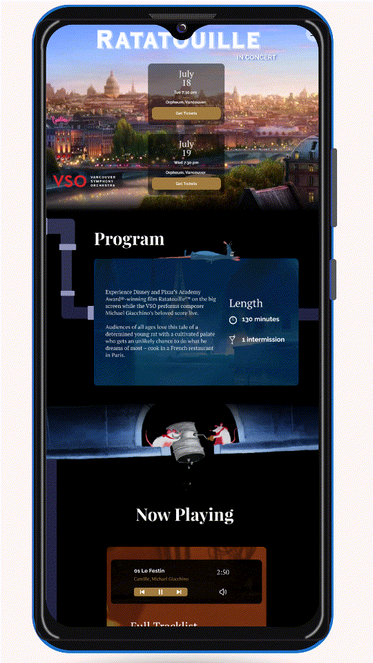
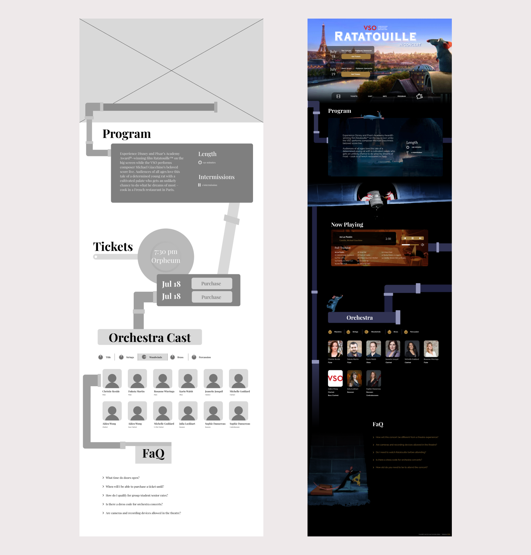
MicrositeWeb Design and Development

Overview
Time

1 month

Software

Figma

Roles

Wireframing, visual designer, web developer (HTML, CSS)

Context

For a school group project, we were tasked with designing and developing a microsite based on a pre-existing event. My team chose to base our microsite on the Vancouver Symphony Orchestra’s “Ratatouille in Concert”, an event where the movie “Ratatouille” plays on a large screen, while the soundtrack is performed live by the orchestra.

Ideation

Images from the Ratatouille art book

I first researched the art direction of the Ratatouille movie. I envisioned the site to feel like you’re exploring the environment of Ratatouille’s Paris through similar objects, colours, and music. The official art book contained lots of graphical elements that provided lots of inspiration and direction for our microsite. Above are images of pages I took from the art book that I took inspiration from, especially noting the intricates of the signage. I created two wireframes that were unique and vastly different in terms of direction.

Wireframes

First Wireframe

The first wireframe is simple. It has the same header decoration for each section, and was overall more structured. It also heavily focuses on iconography, such as the clock in “Tickets” to tell the time of the concert, the ticket button in the first section to purchase tickets, and the clock and pause icons in “Program” to give details of the concert length.


Second Wireframe

The second wireframe is less structured; there are tilted pipes connecting the sections and the section headings are uniquely placed amongst the surrounding elements. This wireframe was expanded on and used for our final website because the pipes were playful and gave the site a unique factor.

We then developed the first and second mockups of the page. From the wireframe, we decided to include a section that allowed visitors to play the soundtrack of Ratatouille, so I designed the “Tracklist” section, which would later be called “Now Playing”.

First Mockups

Mobile Mockup

Desktop Mockup

The mockups above were the first mockups created for the site. Keeping with the colour palette, all the modules were cohesive and had a clear direction and role in the overall goal of the site. Our team used official assets from the movie’s visual development along with the elements I made from scratch on Figma. The first module was simple with the full-screen hero image and invited users to continue scrolling down.

Final Mockups

Mobile Mockup

Desktop Mockup

After receiving feedback, we reorganized how the tickets would be displayed. The tickets section was removed, and the ticketing call to action buttons were added to the first section as well as the sticky navigation bar. This would draw more emphasis to the action of purchasing tickets, allowing visitors to always see the purchase option. We also adjusted the scale of the media player to take up less room and be faster to digest.

Web Development

Orchestra Cast Section

After developing our final mockups, we began to code the website using HTML and CSS. I was assigned to code the Orchestra cast section. This section has dissolve tabs, clicking on each of the instrument groups reveals members of the orchestra that play that instrument.

Media Player Section

I also helped edit other sections, such as the media player’s phone layout and the font styles throughout the website.

Reflection

This project taught me immensely how to design and develop a website from scratch. From creating wireframes out of vague ideas to teaching myself HTML and CSS, I grew my work ethic and research skills. I also developed a new interest in website design and development, which led to design and hand code this portoflio website from scratch.


This project was heavily team-based, I learned how to regularly communicate with my team about what tasks I was doing, and also led some team meetings by reviewing what was done in the past week and what tasks our team would do next.